After more than five decades of national leadership in prevention, Prevent Child Abuse America reached a moment to refresh how its brand and mission was expressed. The organization’s voice and visuals needed to better reflect its growth, its modern approach to prevention, and its role as a connector for chapters and partners nationwide.
RALLY partnered with the organization to realign its brand around that shared vision, developing a new tagline, streamlined symbol, and sharpened brand identity. Together, we strengthened how PCA America communicates its purpose—clarifying its positioning, refining its tone, and giving its visual identity a needed refresh so that the brand communicates hope, unity, and the belief that prevention is possible when everyone plays a part.

Prevention is not only about protecting children; it is about strengthening families. That belief guided every aspect of this refresh. RALLY approached the work as both strategists and storytellers, ensuring that design and message worked together to express prevention as empowerment, connection, and collective action.
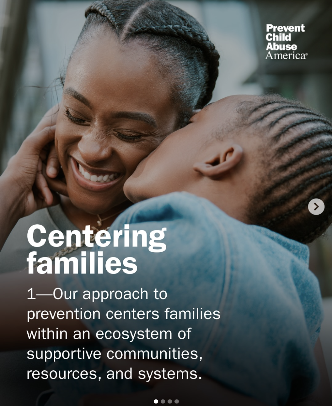
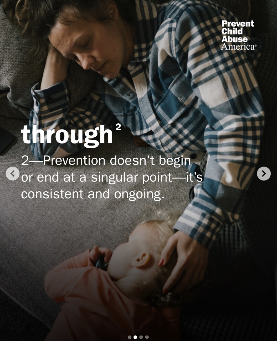
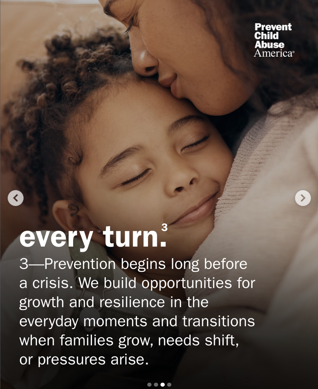
With deep experience aligning complex national networks around shared purpose, RALLY brought a perspective uniquely suited to this challenge. We began by listening to national and chapter leaders, reviewing existing materials, and identifying opportunities to clarify and modernize how the brand communicates. The insight that families sit at the heart of prevention inspired the new tagline, “Centering families through every turn.” More than a phrase, it became a promise—one that unites staff, partners, and chapters around a shared purpose.
To bring that promise to life, we refreshed the organization’s color palette, typography, and pinwheel symbol, and created adaptable templates, social graphics, and motion assets that bring warmth and cohesion to every touchpoint. The result was a unified visual and verbal system that helps the organization lead with clarity and confidence while keeping families at the center of everything it does.
The refreshed brand reintroduced Prevent Child Abuse America as a modern, unifying leader in the national prevention movement. The new tagline and verbal identity brought clarity and warmth to how the organization communicates, while the updated visual system and redesigned pinwheel symbol created consistency across chapters and partners. Through the delivery of more than 50 design templates, motion assets, fundraising and policy materials, and a 45-page brand guide, RALLY equipped teams nationwide to share one cohesive story about strengthening families.
The brand rollout marked a shift in both tone and mindset. Internal teams and chapters quickly adopted the new materials, using them to communicate with confidence, celebrate collaboration, and reinforce the idea that prevention begins with connection. The brand now reflects the hope and unity at the heart of the organization’s mission, reminding every partner and supporter that centering families through every turn builds the foundation for children to thrive.

